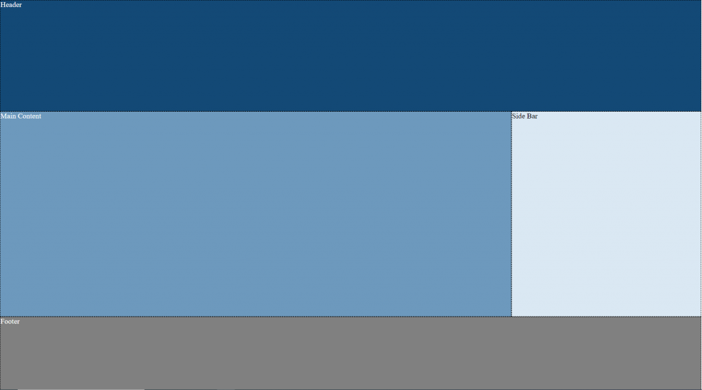
Overview:
This is an easy, clean way to create a 2 column layout with flexbox.
Designing a webpage layout has become much cleaner and easier with the introduction of CSS flexbox. I’ll take you over some HTML and CSS code and explain the process of how to create a 2 column responsive webpage layout. This code can easily be converted to add a third column or tweaked to your needs.
I’ve used flex box for this design because its adaptive, making things mobile friendly is a breeze and also really simplifies the process if you need to reorder your flex items.
If you were looking for a tutorial on centering check out the article here or check out my other web development tutorials here.
Result:
Responsive Website layout with HTML & CSS

HTML Code:
<div id="page-container">
	<div class="row header">Header</div>
	<div class="row main">Main Content</div>
	<div class="row side">Side Bar</div>
	<div class="row footer">Footer</div>
</div>
HTML Code Explained:
The outer div element is flexbox container and the inner elements are flexbox items. Remember if you use IDs for naming any elements, they need to be unique.
I’ve used two classes for each inner div element. One of the benefits from doing this is that you can style every row with only using one class. For styling each element individually you could target each row with eg. ::nth-of-type(element #) however I prefer giving them descriptive class names. I find this helpful when coming back to the code months down the road. Whatever naming convention you go with try to follow a pattern to make things easier on yourself.
CSS Code:
<style>
	body,html {
		padding: 0;
		margin: 0;
		min-height: 100%;
	}

	#page-container {
		display: flex;
		flex-direction: row;
		flex-wrap: wrap;
		height: 100%;
	}
	.row {

	}
	.header{
		background-color: #134976;
		width: 100%;
		height: 300px;
	}
	.main{
		background-color: #6d99bd;
		flex:3 1 600px;
		min-height: calc(100vh - (300px + 200px));
		box-sizing: border-box;
	}
	.side{
		background-color: #dae8f3;
		flex:1 1 250px;
		min-height: 300px;
	}
	.footer{
		background-color: grey;
		height: 200px;
		width: 100%;
	}

</style>
CSS Code Explained:
Remember to set the padding and margins on html/body class to 0px. This will remove any white border around the page edges. Here is a link to a CSS reset if you want to clear all the browsers default HTML styling.
Utilized CSS Properties Explained.
flex-wrap: wrap
- The flex box items will shift to the next line if there isn’t enough available space.
flex-direction: row;
- The flex box items will be ordered from left to right.
Flex: 1 1 600px;
- This property confused me when I first learnt about flex box. Essentially it’s a short hand way to write flex-grow, flex-shrink, and flex-basis.
- flex-grow – This is a proportional value used to dictate the size of space in a flex item. Two flex items with 1 would be the same size.
- flex- shrink: This is the opposite of flex grow and distributes negative space proportionally.
- flex-basis – this is the ideal amount of space the element will try to use.
Box-sizing: border-box;
- This is a cool property in that it tells the element to include its padding and border size in the elements total width.
min-height: calc(100vh – (300px + 200px));
- you can perform simple math calculations using this property
- I’ve used this to set the height of the content area to be all the leftover space minus the header and footer.
- The benefit of this is we don’t need to apply any additional CSS to make the footer sticky, as it will always be at the bottom of the page with this easy line.
If you see an incorrect information or have any questions feel free to contact me.
